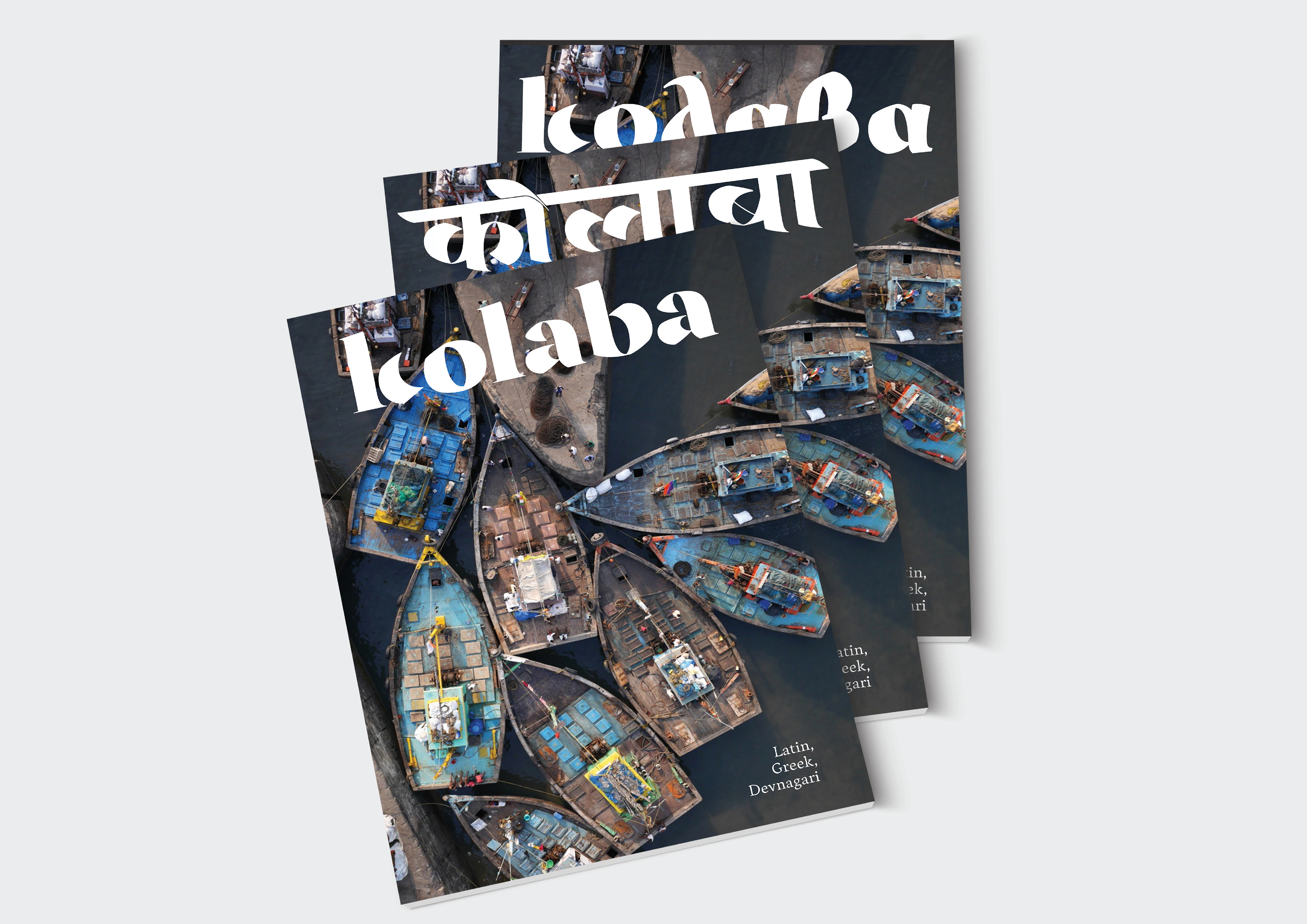
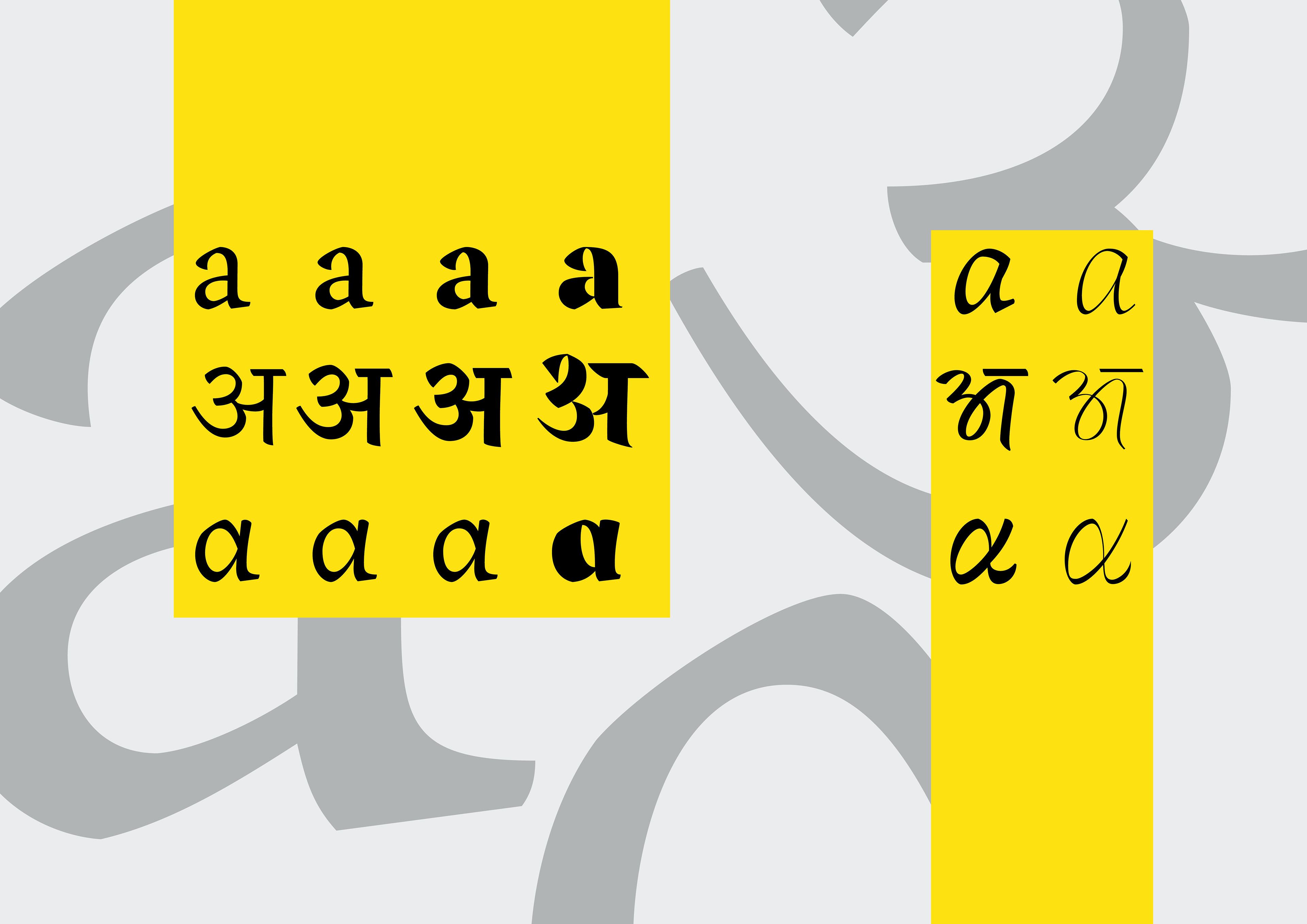
Kolaba is a multi-script typeface for Latin, Devnagari and Greek. The type family began as a solution for editorials with different language editions. Extensive weights have been designed across all three scripts to create a similar hierarchy for all supported languages. The Kolaba family is a versatile system, ideal for a wide range of editorial projects.
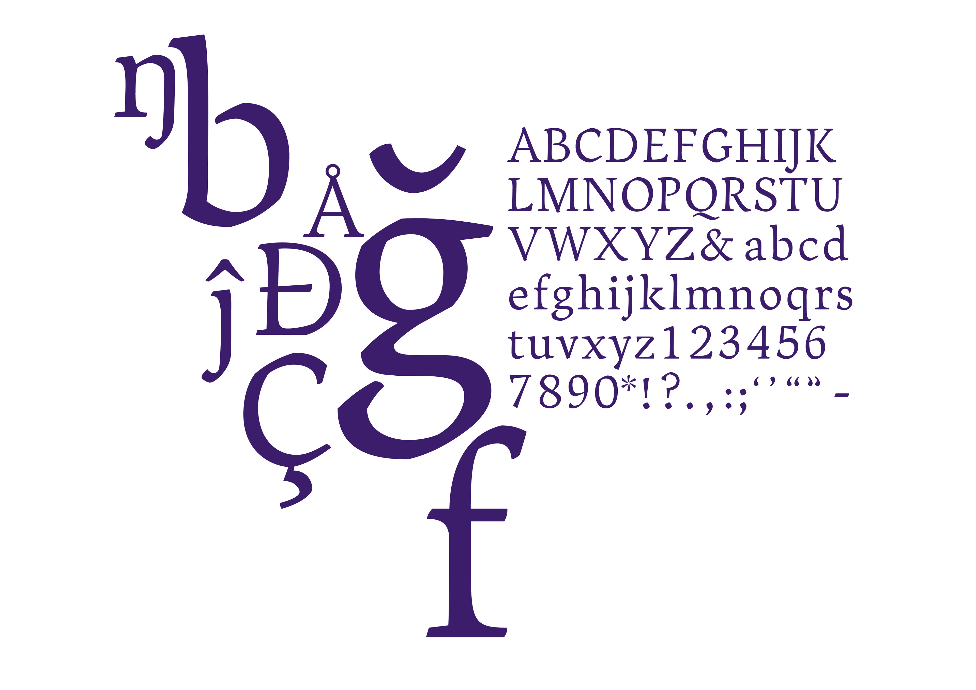
The primary style for Kolaba is in four weights: Regular, Semibold, Bold and Display. The secondary style offers a light and regular weight across all three supported languages: Latin, Devnagari,
and Greek.
and Greek.
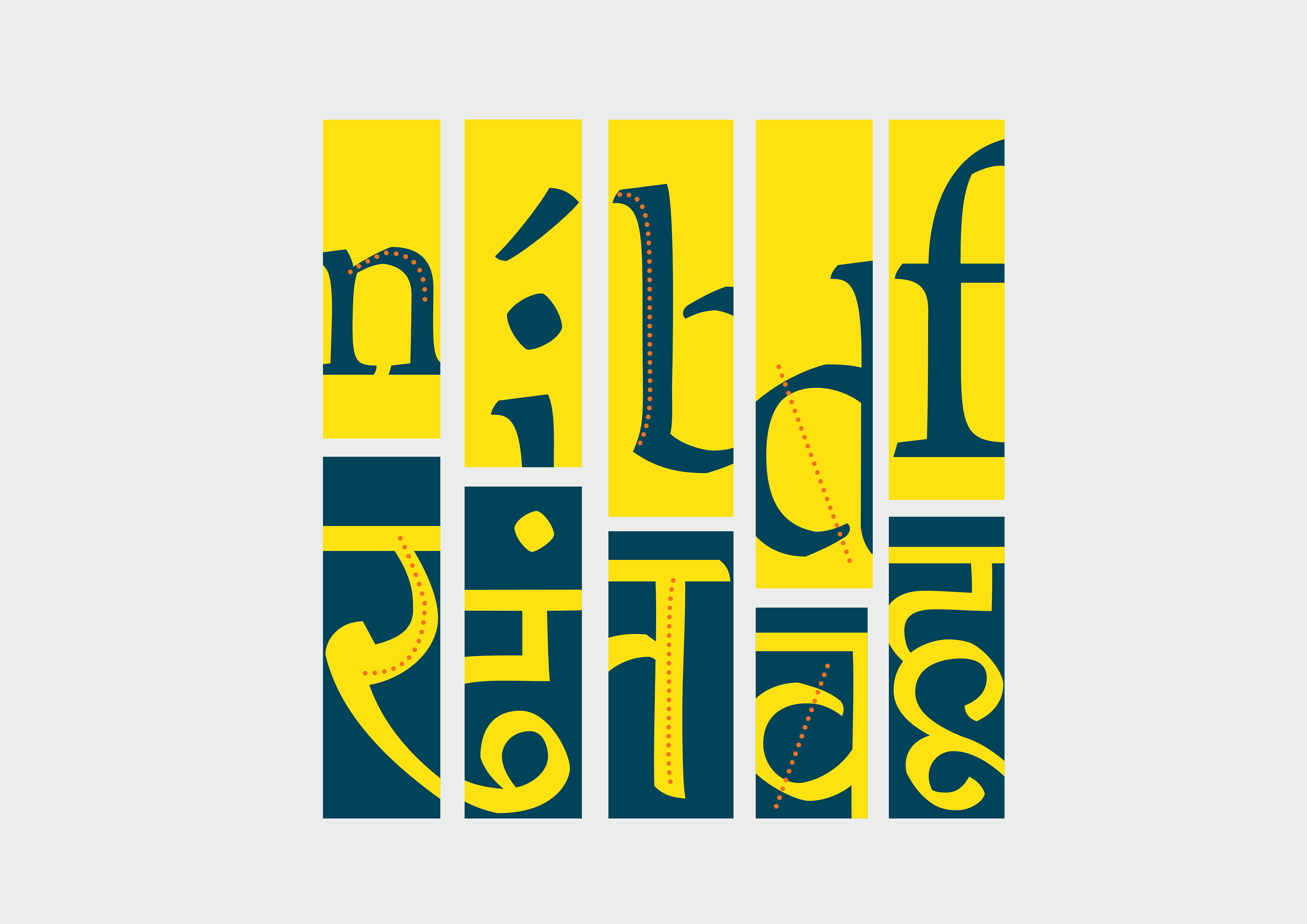
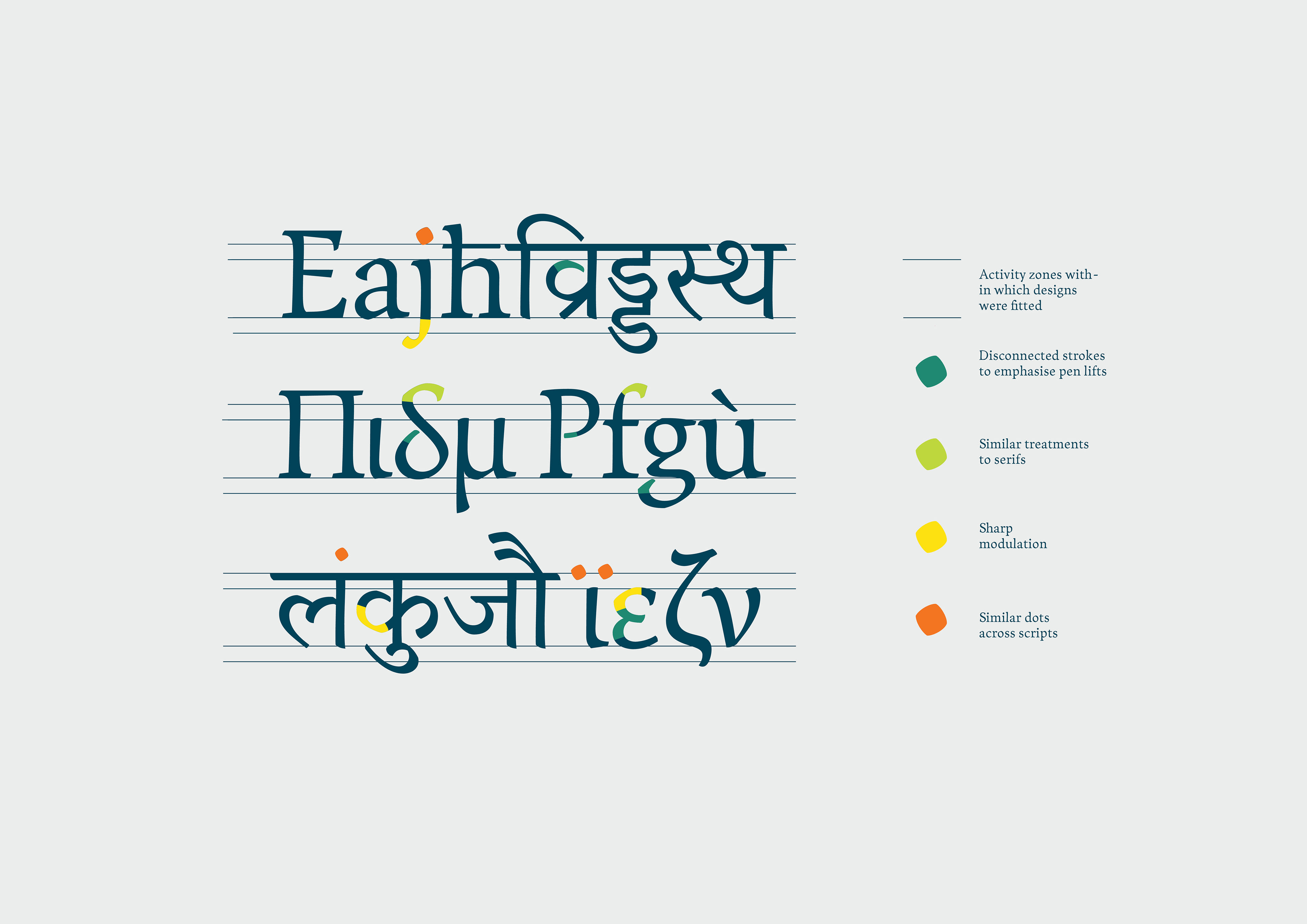
Kolaba draws from calligraphic constrictions of letters for both English and Devnagari. Its regular style has a constructed approach with strong parallel lines made by a flat nibbed pen. This is broken by the softness of a tapered stem and dynamic corners. Its big x-height, and slightly narrow proportions make it a well-suited choice for space saving usages like magazines. Features like the serifs, angular cuts, and a sharp transitions add to the character while also making it functional.
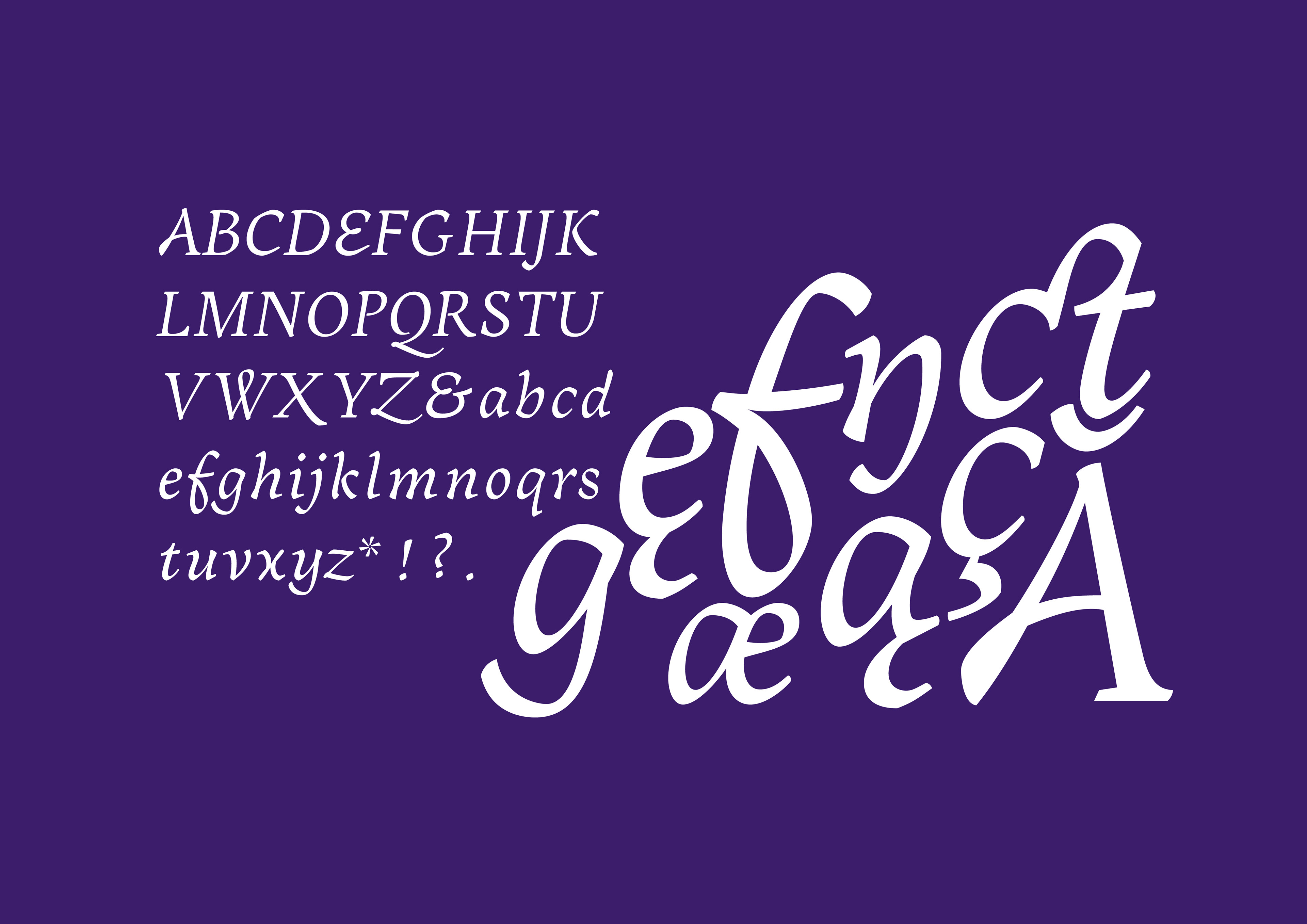
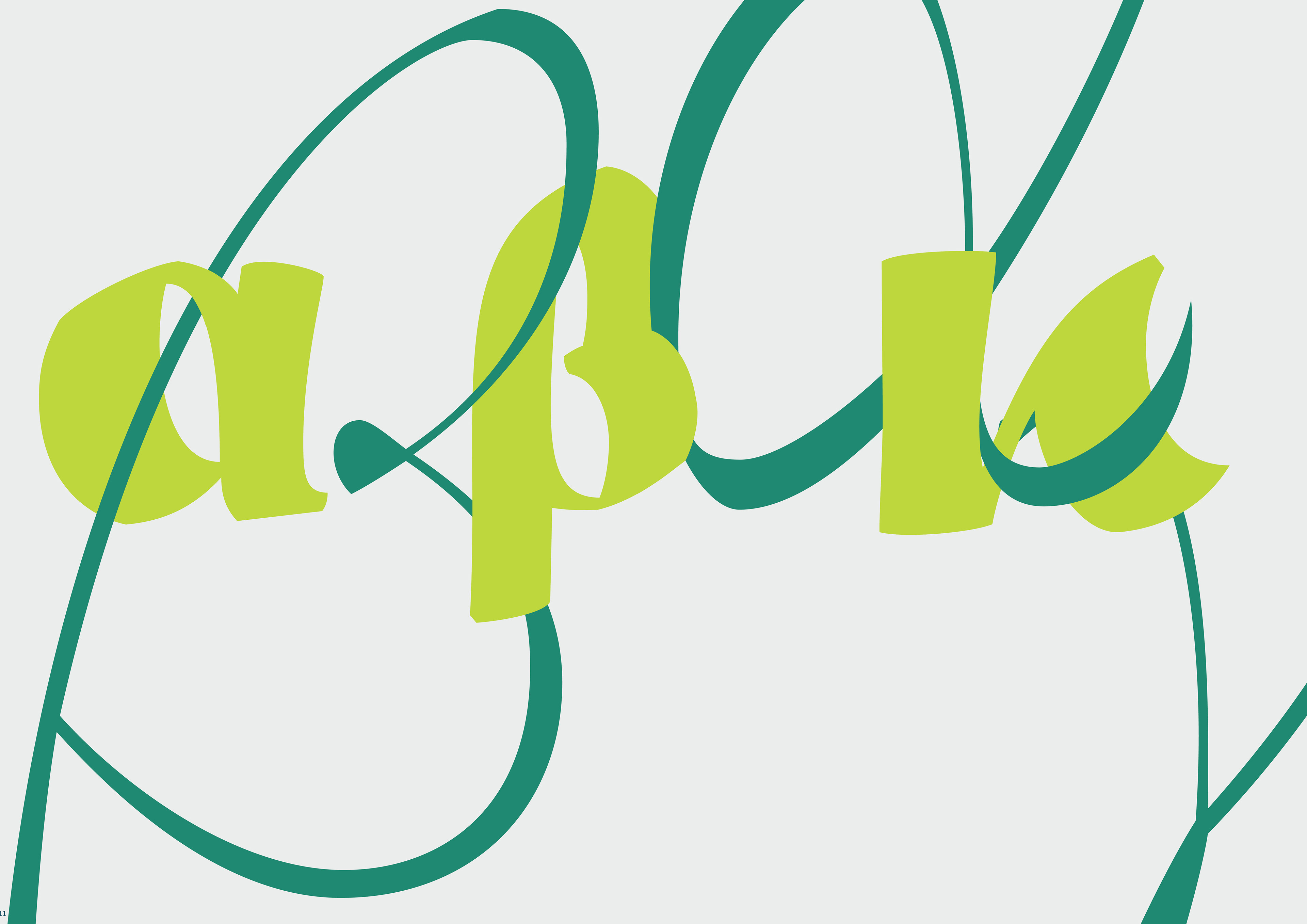
Kolaba’s secondary style is key to the solution for a common voice across scripts. Instead of an oblique roman, the design echoes handwriting with a fast connected stroke forming a letter to create a secondary Informal style. The pen tries to stay on the paper throughout the letter construction because of which the stroke gathers speed and turns in on itself. The overlapping strokes are erased so as to reduce darkness on the joints and so one gets the impression of a ghost stroke.


The display weights helps provide emphasis in a layout while adding flair to the design. The primary display weight exaggerates the disconnected feel evident in the lighter weights and the secondary emphasises the connections of the strokes with a variety of ligatures and contextual alternates.
These weights are available across Latin, as well as Devnagari and Greek

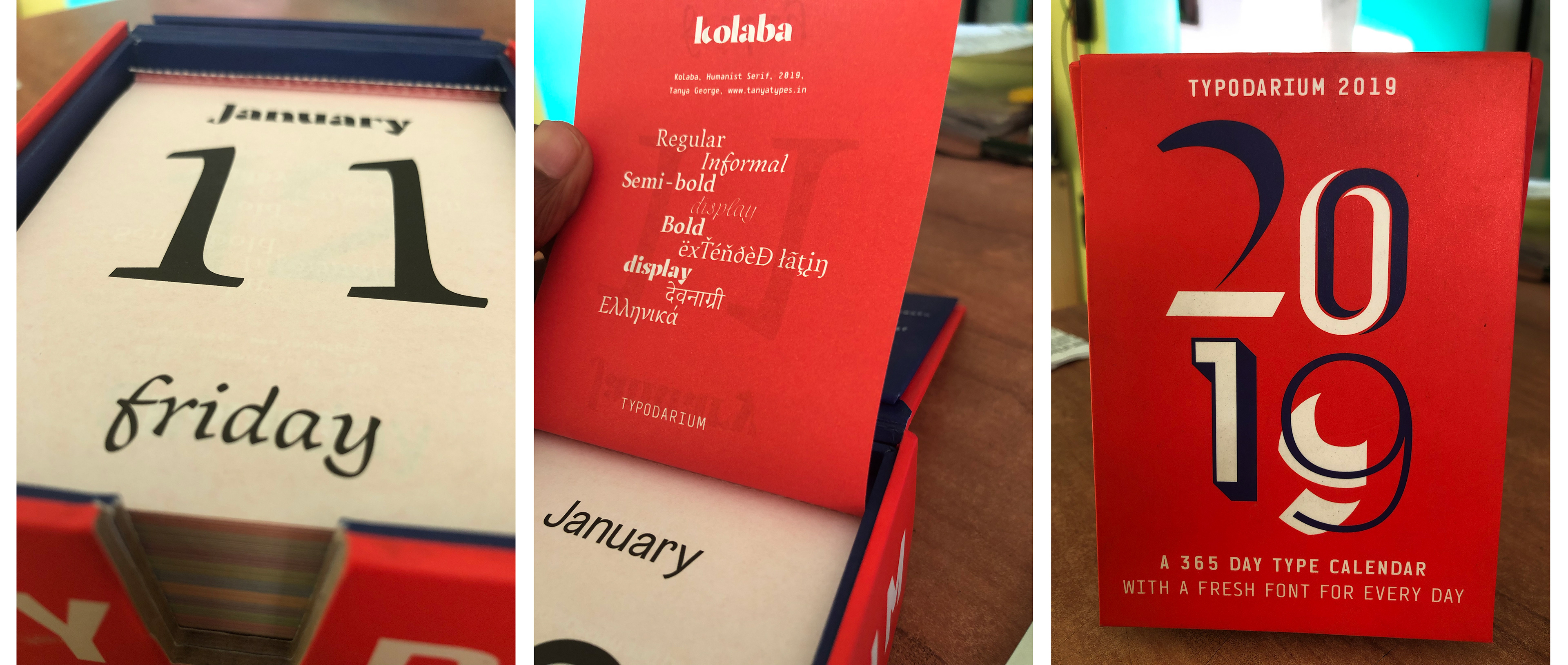
Here are some examples of Kolaba in use. Send me an email if you would like to use it for a project.